


Meet the new Coke…label. For the first time since 2016, Coca-Cola has revamped its look across its range of products. Here’s why the “One Look” strategy works…and what it lacks, too.
There are few brands as iconic as Coca-Cola. Alongside automakers like GM and perhaps the output of Hollywood, there are few brands that claim as pervasive and lasting a role as a sort of de facto American ambassador as Coke, a company worth $84 billion and a market capitalization of over $200 billion. It’s a century-old story of flavor and nostalgia, born in 1896 and adapting alongside Americans through two world wars, a depression, a golden age, the tumultuous 60s and, now, a second pandemic.
For years, Coca-Cola’s most ingenious marketing strategy has been to put itself where we share special moments. That is why they battle so hard to be the exclusive option for concessions at professional sports stadiums, cinemas, and events and festivals. It’s also why some of their most successful advertisements focus on holidays like Christmas; wherever we feel happy and content, or at least wish we did, the goal is to have a Coke as a part of that memory.
But for all of its marketing strategy over the years, the true tangible and visible power of Coca-Cola comes in the form of its script logo. That red and white look is as instantly recognizable as any brand in the world, ranking as the most recognized brand in the US and the sixth most in the world behind Apple, Amazon, Google, Microsoft, and Samsung.
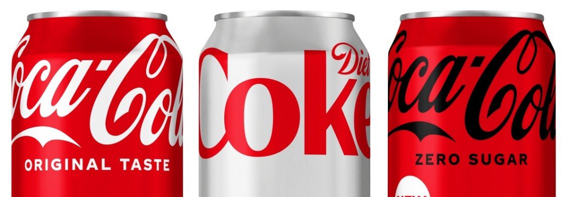
For all of those reasons, it’s a big deal when Coca-Cola makes a tweak to its packaging. In a way, they tipped us off in February by releasing a new-look Coke Zero, and now all of its Coke drinks share slightly different versions of the same design. Each design shifts the Coca-Cola script to the top of the label; clever because now it’ll be visible while people are actually holding the can. Each design uses the same Coke red on a varying background or font color.
One of the benefits of the change is that it makes the visual appearance more uniform, which could induce more consumers to experiment with different kinds of Coke. Part of that motivation is due to the rise in popularity of Coke Zero, a zero-calorie option that has benefited from a renewed health focus in the US and Europe. That popularity may also be due in part to a new recipe that makes it taste a bit more like the original Coke.
The One Brand strategy, and the new look, was consumer-driven. Focus groups and feedback found that consumers had a hard time discerning the difference between Coke products or finding reasons to try different versions; many apparently found the differentiated marketing, messaging, and branding too effective, essentially turning Coke products into stand-alone brands rather than what the food and beverage industry calls “line extensions”. One of the possible drawbacks of the move involves that very issue; Coke Zero as a brand, or Diet Coke for that matter, holds value to a consumer as a more health-conscious option. By forging closer links to the “real thing”, will that short gap of differentiation cause these lower-calorie, lower-sugar options to lose their shine?
Like the look? Let us know what you think.